Outline
Contents
Outline
This notebook is an outline of the project, including introducing basic properties of the simulated data and applied methods.
This notebook create some panels that are part of Figure 1 of the paper version of this project.
# Setup notebook state
from nbutils import setup_notebook; setup_notebook()
import numpy as np
import matplotlib.pyplot as plt
from neurodsp.sim import sim_powerlaw
from neurodsp.utils import create_times
from neurodsp.spectral import compute_spectrum
from neurodsp.plts import plot_power_spectra
from neurodsp.plts.time_series import plot_multi_time_series
from neurodsp.plts.utils import make_axes
from neurodsp.utils import set_random_seed
from fooof.utils import trim_spectrum
# Import custom project code
from apm.io import APMDB
from apm.methods import *
from apm.plts.base import plot_dots
from apm.plts.utils import figsaver
Coloured Noise Signals
In this notebook, we will introduce and simulate some example ‘coloured noise’ signals.
Coloured noise signals are signals with particular statistical properties - notably that there power spectrum has a particular pattern of power across frequencies.
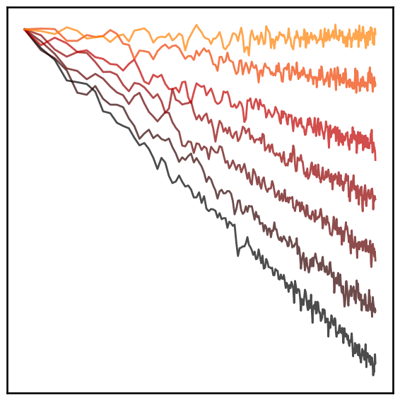
For example, white noise has a flat power spectrum, with equal power across all frequencies. Other colours of noise have different patterns of power - for example, pink noise has decreasing power across increasing frequencies, and brown noise even more so.
In this notebook, we will simulate and visualize some different coloured noise signals.
Settings
# Simulation settings
n_seconds = 100
fs = 1000

f_range = (0.25, None)
# Define set of simulated exponents to use
exps = [-3, -2.5, -2, -1.5, -1, -0.5, 0]
# Define exponent values for visualization
exps_viz = np.abs(exps)
# Define times definition
times = create_times(n_seconds, fs)
# Define colormap map
cmap = [plt.cm.gist_heat(ind) for ind in np.linspace(0, 1, len(exps) + 2)]
# Define plot settings
plt_kwargs = {'color' : cmap[0:7], 's' : 7**2, 'add_corr' : False,
              'xlim' : [-0.35, 3.35], 'xticks' : [], 'yticks' : [],
              'title_fontsize' : 14}
# Settings for saving figures
SAVE_FIG = True
FIGPATH = APMDB().figs_path / '01_outline'

# Create helper function to manage figsaver settings
fsaver = figsaver(SAVE_FIG, FIGPATH)
# Set the random seed
set_random_seed(7)
Simulate Signals
First, we will simulate example time series, and compute their spectral representations.
# Simulate an example signal of each specified exponent
sigs = []
for exp in exps:
    sigs.append(sim_powerlaw(n_seconds, fs, exp, f_range))
# Compute power spectra for the powerlaw signals
all_powers = []
for ind, sig in enumerate(sigs):
    freqs, cur_powers = compute_spectrum(sig, fs, nperseg=5*fs, noverlap=fs)
    freqs, cur_powers = trim_spectrum(freqs, cur_powers, [1, 50])
    all_powers.append(cur_powers / cur_powers[0])
Plot the Simulated Signals
# Plot simulated time series, across 1/f properties
plot_multi_time_series(times, sigs, colors=cmap, xlim=[0, 1.0], xticks=[],
                       lw=2.0, alpha=0.7, xlabel=None, ylabel=None,
                       figsize=(10, 3.5), **fsaver('time_series'))

# Plot power spectra of different noise colours
plot_power_spectra(freqs, all_powers, colors=cmap, alpha=0.7, minorticks=False, lw=2,
                   xlabel=None, ylabel=None, xticks=[], yticks=[], **fsaver('power_spectra'))
Measures
Next, we can introduce the different method categories to be examined in this project.
# Define list of measures
measures = ['autocorr', 'fluctuations', 'fractal', 'complexity', 'entropy', 'exponent']
# Define list of titles
titles = {
    'autocorr' : 'AutoCorrelation',
    'fluctuations' : 'Fluctuations',
    'fractal' : 'Fractal Dimension',
    'complexity' : 'Complexity',
    'entropy' : 'Entropy',
    'exponent' : 'Exponent',
}
# Compute measures
results = {measure : np.ones(len(sigs)) * np.nan for measure in measures}
for ind, sig in enumerate(sigs):
    results['autocorr'][ind] = autocorr_decay_time(sig, fs, level=0.1, max_lag=2000, lag_step=1)
    results['fluctuations'][ind] = dfa(sig, fs=fs)
    results['fractal'][ind] = higuchi_fd(sig)
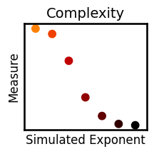
    results['complexity'][ind] = lempelziv(sig)
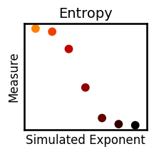
    results['entropy'][ind] = app_entropy(sig)
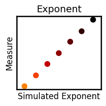
    results['exponent'][ind] = specparam(sig, fs=fs)
Visualize Method Results
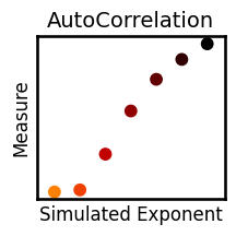
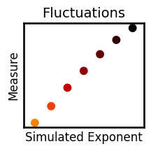
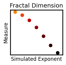
# Plot measure results all together
axes = make_axes(1, 6, figsize=(12, 2.5))
plot_dots(exps_viz, results['autocorr'], title=titles['autocorr'], ax=axes[0], **plt_kwargs)
plot_dots(exps_viz, results['fluctuations'], title=titles['fluctuations'], ax=axes[1], **plt_kwargs)
plot_dots(exps_viz, results['fractal'], title=titles['fractal'], ax=axes[2], **plt_kwargs)
plot_dots(exps_viz, results['complexity'], title=titles['complexity'], ax=axes[3], **plt_kwargs)
plot_dots(exps_viz, results['entropy'], title=titles['entropy'], ax=axes[4], **plt_kwargs)
plot_dots(exps_viz, results['exponent'], title=titles['exponent'], ax=axes[5], **plt_kwargs)

# Save out individual plots
for measure in measures:
    plot_dots(exps_viz, results[measure], title=titles[measure], **plt_kwargs, figsize=(2.5, 2.5),
              xlabel='Simulated Exponent', ylabel='Measure', label_size=12, **fsaver('plot_' + measure))
Text Plot
This section makes an additional panel for the paper figure.
# Define text plot settings
text_plt_kwargs = {
    'fontdict' : {'fontsize': 16},
    'horizontalalignment' : 'center',
}
# Plot text labels
_, ax = plt.subplots(figsize=(1, 3))
ax.text(0.5, 0.80, 'White', color=cmap[6], **text_plt_kwargs)
ax.text(0.5, 0.60, 'Pink', color=cmap[4], **text_plt_kwargs)
ax.text(0.5, 0.40, 'Brown', color=cmap[2], **text_plt_kwargs)
ax.text(0.5, 0.20, 'Black', color=cmap[0], **text_plt_kwargs)
ax.axis('off');
if SAVE_FIG: plt.savefig(FIGPATH / ('noise_colors.pdf'))
